Interactive Galaxy Menu Graphics

#1
Simple. Make a map of the 9 galaxies with a few good graphic-designed planets/stars/space clouds/colors etc. with interactive buttons instead of typing in numbers to search.

This could also go with the whole "Galaxy Names" topic (link below).

viewtopic.php?f=7&t=3135&p=64749#p64749

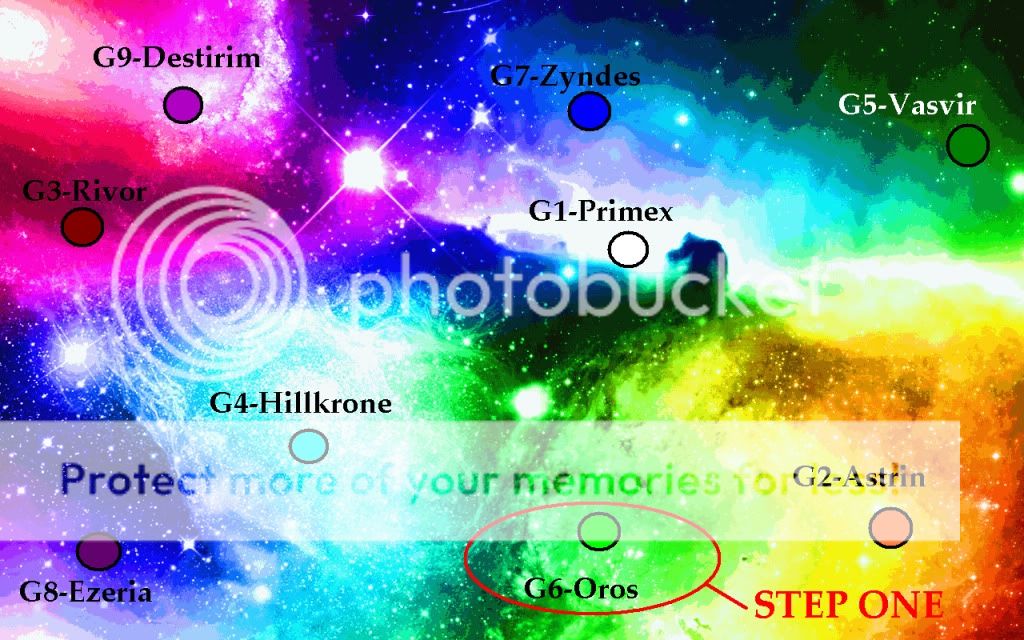
The galaxies each have a different primary color. After you click on the solar system/name/other item that's interactive for that galaxy (with listed name and corosponding number), you then go to a page with another colorful galaxy-type interactive wallpaper designed around the primary color of the galaxy you chose. On different areas of the page, you'd have a few options. Systems 1-100, 101-200, 201-300, 301-400, 401-499. After the option chose, you can then go to another page to specify which system your looking for (like the current galaxy page).

Once the system is chosen, you'd go to a page that shows 15 planets total orbitting around a star/sun in the middle with an option menu on the side of the planets (like the current galaxy page) that displays mission titles: probe, missile launch, message, etc. with the players name, and planet name above the planet. If the planet is not colonized, the words "empty" would appear where the player's name would be in a different color.

Here's an example, searching for one of my own planets:


STEP ONE: Click a galaxy. Example: Choose G6, Oros.

Image


STEP TWO: Click a system.

Image


STEP THREE: Select a mission. (I only added a few options obviously...)

Image


Obviously there won't be different graphics for every system/planet. It should be randomized yet repeated like our planet graphics are currently. I beleive that this'll add a ton of character to the game and make searching for targets much more fun . Pluse, the one-click interaction shouldn't slow down search time from clicking the current arrows or typing in numbers like we have now. Comments?
_______________________Public Relations Administrator______________________
Image

__________________A tongue of silver is worth plenty in gold._________________
[/color]

Re: Interactive Galaxy Menu Graphics

#3
gale,you do seem to be a visual/color person which is why I am not surprised you made this,However while I am not a total text based kind of person I cannot agree with this.Is this even neccesary to be done?I understand it could be more fun[and more planed out looking]but I do not see a true point.beyond not having a point this could greatly increase load time and the time it takes to launch a mission on a planet.even if searching for a specific one.lastly what about those that perfer the curent system for any number of reasons?(i.e.are text based,perfer that for searching in wide quick scans[this could have alot of backspacing to switch between sectors],and maybe even disliking the change because they are very habitual.This doesn't really have any neccesity or many positives so no from me.
Gale points:ummm to far behind to care and too long since I got one to remember
Image

That which is written without effort is usually read without enjoyment.

Re: Interactive Galaxy Menu Graphics

#5
A data base of text universes+a data base of visual ones.that shouldn't throw off server space too much.only halve it.or at very least have them supporting 2 sets of uni's full of planets and 4 ways to represent them.
Gale points:ummm to far behind to care and too long since I got one to remember
Image

That which is written without effort is usually read without enjoyment.

Re: Interactive Galaxy Menu Graphics

#6
Dr_triad3 wrote:Is this even neccesary to be done?I understand it could be more fun[and more planed out looking]but I do not see a true point.beyond not having a point this could greatly increase load time and the time it takes to launch a mission on a planet.even if searching for a specific one......This doesn't really have any neccesity or many positives so no from me.
I understand it's not necessary. But neither was a flashier skin for the forums or the new player profiles. However, the skin and player profiles will attract non-players to play the game. It's attractive, and therefore will help with Zorg's player population.
Dr_triad3 wrote:lastly what about those that perfer the curent system for any number of reasons?(i.e.are text based,perfer that for searching in wide quick scans[this could have alot of backspacing to switch between sectors],and maybe even disliking the change because they are very habitual.
Seth1483 wrote:well then have it in the options then
I agree with Seth. As for me, I'll have to stick with the old menu because of my lack of good internet. But for people with high-speeds and good connections, this would be a very nice and entertaining system to use.
_______________________Public Relations Administrator______________________
Image

__________________A tongue of silver is worth plenty in gold._________________
[/color]

Re: Interactive Galaxy Menu Graphics

#7
I really like this and would take it as suggested without complaint, however, I do think that it would be better if there were one less screen to navigate through perhaps if the "step two were remove so it would go more like this

Step one chose galaxy from awesome colorful map

Step two select a system (this should be a pop up window that opens when you hover over a galaxy in the map mentioned in step one. It will function similar to the current galaxy menu where if you hover over a players moon it will let you then choose to send espionage probes, only you will have to manually input the numbers for the system you want. The main point here is that it would be best if it were not necessary to load an entire page for this step)

Step Three select the planet which will be depicted in fashionable style as described by Gale. (Also there should be a next system previous system arrow for ease of navigation between systems.)
Those with nothing to loose have the most to gain. Long live the Miner!

Re: Interactive Galaxy Menu Graphics

#8
@gale
your first statement is very true.but still neglects those current habitual more likely to buy rubies players.the second statement solves that but the question remains will it get zorg more money than they lose in implementing this.If any on either side.
Gale points:ummm to far behind to care and too long since I got one to remember
Image

That which is written without effort is usually read without enjoyment.

Re: Interactive Galaxy Menu Graphics

#9
Well first of all, Gale, this is a seriously epic idea. The layout looks amazing, however I would like to see the transition between the System sections to the planetary screen.

That being said, though, I would have to agree with Triad on the grounds that this is not necessary and therefore likely to take a back seat if approved. Not only that but unique graphics can be expensive to produce. Nevertheless, a unique addition like this would make ZE stand out from the related games in the genre.
Image
When people ask me plz because it's shorter than please, i feel inclined to respond no because it's shorter than yes...

Re: Interactive Galaxy Menu Graphics

#10
Istalris wrote:Not only that but unique graphics can be expensive to produce. Nevertheless, a unique addition like this would make ZE stand out from the related games in the genre.
I took the expenses into consideration. The "graphics" would be no more than a well done CGI background with hyperlinks/buttons layered on top (much like is possible in the standard microsoft slideshow). It takes me about 20 minutes to make a signature for players in a picture editing program, so time shouldn't be an issue. The hyperlink buttons I could make myself at home, so purchasing of any other type of software shouldn't be necessary. In all honesty, I could make this myself.

The only semi-difficult part about this would be creating the http code in the website layout which may take some time, but would not be hard to construct.

This new layout would take up the same storage space as the current layout, but it would be much more balanced and overall safer. This being because right now, everything that we can load comes from one specific page and, therefore, one specific file in the web layout. With this new idea, it would be split up into 9 files (one for each galaxy) and would take the same amount of space because it's the same amount of info that we have now (no added systems, etc). I'm not talking about moving graphics or anything, just interactive wallpapers so to speak.

In conclusion, this wouldn't cost hardly anything to make due to its simplicity and the time of construction would be extremely short. The only extra space that would be added into the site layout would be the backgrounds, seeing as how we already have manual-hyperlinks in-game with the current system. Yes, I do believe it'll make more many than they'll spend on it. It's cheap, attractive to the eye, and will isolate ZE from the rest of the basic-MMO's in the genre. Like the player profiles and the new forum skin, I believe it'll represent a push forward for ZE and encourage players to keep playing and new players to join the game. And as stated before, this could be an option for all players to use and turn on/off when desired so not to disgruntle DSL users.


Thank you so much for your comments. I've answered to the concerns about money, construction, layout, memory, and load-time. I believe that's all the concerns that were listed. I hope this answers all of your questions and perhaps will allow you to reconsider. I honestly can't see that we have anything to lose by implementing this idea.
_______________________Public Relations Administrator______________________
Image

__________________A tongue of silver is worth plenty in gold._________________
[/color]